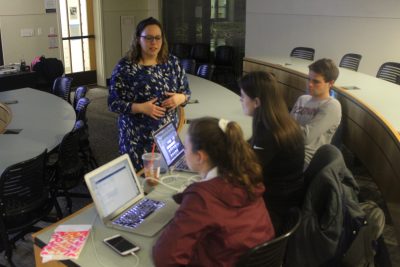
 On Thursday, November 7th, Hanover Insurance and OPIM Innovate co-sponsored a Data Visualization workshop. Run by Olivia Rossetti (Management ‘15), Senior Data Integrity Specialist at Travelers and UConn alum, students were introduced to data visualization fundamentals and the Tableau software.
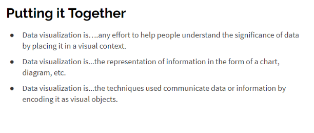
Rossetti’s framework for introducing students to data visualization began with a general overview of the topic. After defining the purposes of both data and visualization separately, she presented students with the three following definitions:
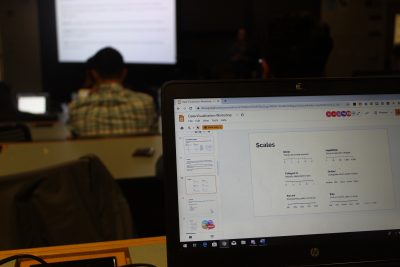
In order to visualize data, students had to understand the four key components of data visualization: visual cues, the coordinate system, scale, and context. Whereas visual cues use elements such as shape, size, and color to portray certain values, the coordinate system, scale, and context of a visualization assign additional meaning to those values. Take a bar chart, for example. The length of each bar indicates a numeric value, and color can be used to distinguish between categories. Meanwhile, the chart’s coordinate system can help users determine specific values, and any added labeling, annotations, and titles can help users identify the context of the data being shown.
 Of course, with any chart or visualization, there is always an intended purpose and audience in mind. For data visualization, artists can compare between data points, display parts of a whole, help users identify relationships, or even show the distribution of a dataset. What to do, however, depends on the needs of the audience, including what they may not know and what they could potentially get out of a certain visualization. For example, if someone wants to know the types of users that log onto a website, it wouldn’t be productive to create a visualization showing a distribution of total logins throughout the week.
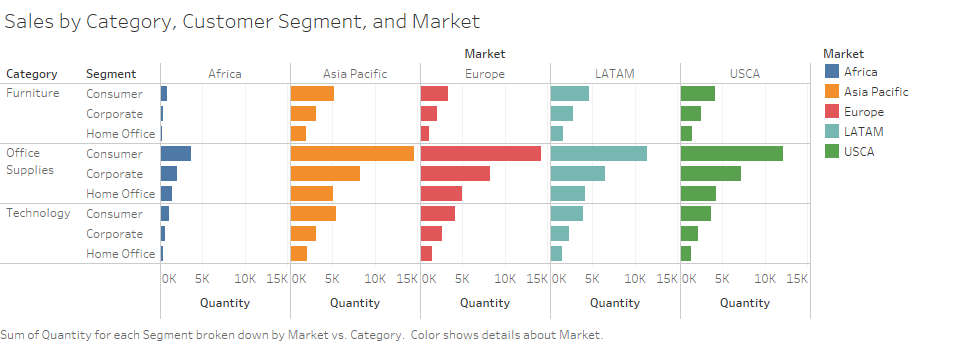
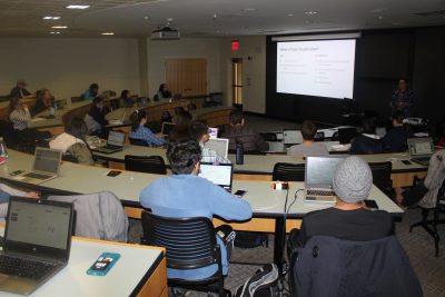
After Rossetti walked attendees through the foundational knowledge needed to understand data visualization, she proceeded with the hands-on component of the workshop–working with Tableau. Everyone gained access to the software through the School of Business virtual machine, and exercises were completed in real-time. One of the many visualizations made consisted of using a provided superstore dataset to display sales by product category, customer segment, and market:
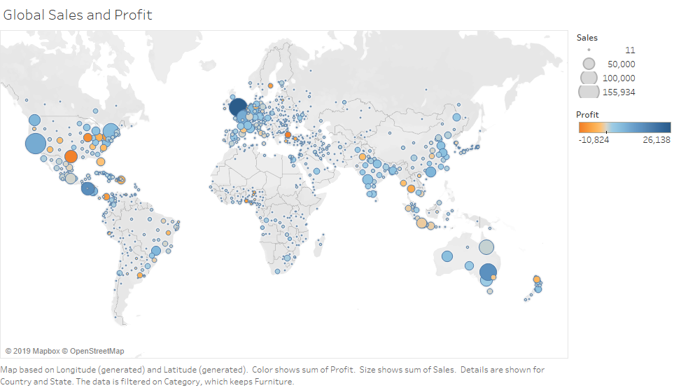
Another, more intuitive visualization, consisted of portraying global sales and profit. Size was used to indicate the degree of success for sales. Color was used to indicate profit at a gain or loss:
 After the workshop, I approached Rossetti regarding her motivations for returning to UConn, not only as a guest lecturer, but also as an adjunct faculty member. Outside of this Data Visualization workshop, she teaches OPIM 3804: Data Visualization, open to all Management Information Systems (MIS) students and Data Analytics minors. “When I was a student at UConn,” she said. “I wasn’t sure in which direction I wanted to go in. I started as a Management major, finished all of my requirements, and then heard about the certificate in OPIM [the Data Analytics minor]. That led me into the world of analytics, a path I never imagined. Because I had that opportunity as a student, I was exposed to classes that were taught by adjunct faculty. There, I was able to see what they were doing in the real world, and what tools they were using. I knew from the moment I met one of my teachers [adjunct Marshall Dougherty], that I wanted to provide the same experience down the road–I wanted to make an impact.”
We thank Olivia for her contribution to the Hanover Challenge and to the MIS curriculum. We also extend a warm thank you to everyone who attended the Data Visualization workshop!